When designing a new product UI, I alway try to employ the K.I.S.S method, of “keep it simple stupid”, it hasn’t failed me yet. If on the other hand you have no choice but to create a new custom control then provide the developer with a “pixel accurate” screenshot that includes all dimensions and measurements. Then, test your new creation with a test user to make sure that someone other than yourself sees the genius.
The screenshots that appear in this article are a selection from the original “product functional deck” that were leveraged throughout the development process.

Visual Design Objectives
The objective of a good UI is to effectively engage your audience and guide their experience. Therefore, the product’s aesthetics should capture and entice you the user throughout the users experience. All of this must occur while adhering to the design principles of a web interface.

The trick is to take the standard set of UI components and to create something new, fresh and innovative.

The visual design should shape and improve the user experience. This can be achieved by utilising CSS effects, typography, spacing, layouts, and colour.
Design Fundamentals
A good designer considers and utilises a variety of fundamentals, including unity, Gestalt properties (proximately, similarity, continuation, closure) , space, hierarchy, balance, contrast, scale, dominance, and similarity.
Defining the Application Building Blocks
A good place to start this process is to identify the main content items that you will need to represent in your application interface and then create an object legend that utilises these design principles that I previously mentioned.

Effective Product Design
An effective product design ensures that the content remains central to the page or function, as well as enhancing the experience by engaging users. The objective is to make the user enjoy the product, build their trust and keep them interested.

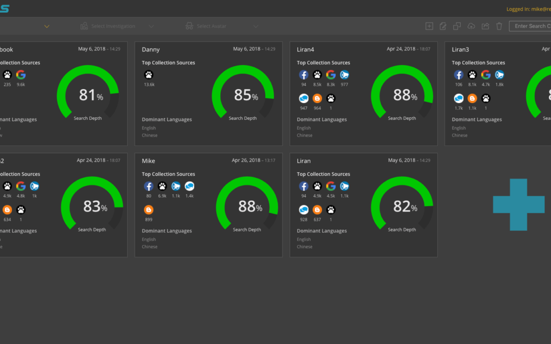
Visualisation and Flow Example
The following example uses a topological graph and coloured icons and connection lines to illustrates a social network user profile and displays their written online posts and the subsequent friends and friends comments. The lines illustrate the interconnectivity between the different users.

The user can then select a node or group of nodes in order to further examine additional details and information as displayed in the extended details pane on the right of the screen.

Finally the user can select an individual node to expose the actual post and subsequent user comments in the popup modal. The post and sub-comments also show the date that the post and comments were written and by whom they were written and in what social network environment.

Notice the use of icon colours and similarity for illustrating content type, textual hierarchy for showing relative structure, contrast and dominance to show selected node objects and scale or object node size to reflect the amount of text in a post and the amount of comment that are associated with a particular post.
Colour Usage
Choosing the right colours for your project is very important because it sets the tone for the mental associations, emotions and meanings in the product. Follow the brand colours and use them wisely depending on a design and message you wish to create.

Complying to WCAG
When creating a interface design it is important to consider compliance requirements so that your product can be marketed and sold to government institutions that demand adherence to specific guidelines and best practises.
Web Content Accessibility Guidelines (WCAG) 2.0 helps make the web based products more accessible to people with disabilities. Accessibility addresses a wide range of disabilities; visual, auditory, physical, cognitive, and more.
You can use the following parameters to affect your colour palette options for your interface.
- HSL (Hue, Saturation, Lightness) – To create a good interface design, the real identity of a colour should be the Hue.
- Selecting the Main Hover and Selection Colour – It is always important to select your main hover and object selection colour at the beginning of the design process. It usually can derived from the company of product logo.
- Adjusting the Lightness to Create a Colour Palette – And then we can adjust the lightness to develop select tones to create a palette
Graphic Design
Software Graphic Design is the pursuit of pixel perfection. Ensuring that UI components are aligned, texts have perfect kerning and colours conform to brand guidelines.
HPE CS200 Server – (UI Example 2)
Not all product interfaces need to be washed with bright colours and fancy animations. Sometimes the product requires a simple and clean interface design that will instil stability and confidence in the product such as the first time configuration of a server or gateway installation.
I created the following UX/UI design for a Hewlett Packard Enterprise CS200 Blade Server using a minimised colour palette.

Keeping the design clean and simple accentuates the simplicity and ease with which the user can configure a complex and very important utility representing the backbone of the company.

It is also very important to consider the user persona for a specific product. Some customer types don’t care for fancy bells and whistles. They want simplicity and reliability for their user experience. The main user type in this case is a DevOPs user.

Don’t waste their time on fancy colour palettes and CSS animations, they won’t appreciate their time being wasted.

Just let them do their job and get the server up and running as quickly and as simply as possible.
Product Mockup Designs
A mockup is a 1:1 scale model of a design used for demonstration, design evaluation, promotion, and other purposes. Mockups are designed to show the final look of the design with all the visual details, such as colours and typography.

The mockup looks more like a finished product or prototype, but it is not interactive and not clickable. Mockups are used for offering a range of options for structuring screens in applications. Along with layouts, they help organize content and make the user interface understandable.

Typography and Font Usage
Typography is the art and technique of arranging type to make written language legible, readable, and appealing when displayed. It is a driving force in all forms of communication art.
It is the art and science of font style, appearance, and structure which aims to deliver the aesthetic and easily readable copy to readers. When attempting to navigate a software interface and understand the overall structure of a function or task the typography layout and design is instrumental in providing the user with an accurate understanding of what they are looking at on the specific screen.

Utilising Motion Design
Today’s UI design relays heavily on motion design techniques which creates instant user feedback for many user interfaces. Animations, CSS visual effects, and screen transitions have a huge impact on applications first-time users.

The main point of the great design is to razzle and dazzle users. When you add a cool feature to an application remember that without the proper design it will be not found by the user. Motion design is one of the most powerful techniques for accenting the way product works.
There’s nothing more attractive than a web or mobile application created using motion design techniques.
Motion design is becoming more important to interface design and is starting to drive the entire UI. The animation will compliment your design and brand identity. Motion design is a powerful tool to keep your users focused on your application.
A Good Place to Start Using Motion Design
- System status – loading bars and popup notifications
- Navigations and Transitions – hierarchy and connection between elements, function changes
- Use Movement – hover and mouseover functions
- Visual feedback – the acknowledgments that a task has been completed and results of a performed task
Conclusion
The ability to design an amazing and unique product fall somewhere between artistic skill and exact science. Often stakeholders in the food chain such as software/QA engineers and product managers incorrectly assume that designing a software product interface is just an abstract art form.
That couldn’t be further from the truth. Designing a unique software product is most certainly an exact science that leverages artistic skill and creativity to make something new from the finite set of standard UI components that are available to the designer and front-end developer.
Related Articles
I have utilised various techniques to build my product solutions, such as product strategy, design techniques and agile methodologies described throughout a series of related articles.
If you wish to expand you knowledge on some of these topics use the following links to learn more about how to understand, plan and execute a product strategy for your company.
How to Prioritize your Product Backlog
A product backlog is the definitive list of all the new epics, features (changes to existing features), user stories, bug fixes, infrastructure changes and maintenance items of your software product. It is also the place to add any other additional tasks that a...
UX Prototyping – The Only Way to Fly
Creating a software solution is a labor intensive human endeavour. It requires input from many different disciplines and stakeholders for it to reach fruition. So, before you start to crunch code maybe you should give some thought to first building a full interactive...
UX, Docs & Help – The Holistic Solution
When designing and creating a software application, there are many different aspects to consider during the planning phase. There are of course the obvious primary tasks, such as ensuring that the product solves a problem that exists in the target market, which...
Recent Comments