HP & HPE
Helping you connect, protect, analyze, and act on all your data and applications wherever they live.
From edge to cloud, so you can turn insights into outcomes at the speed required to thrive in today’s complex world.

The following section shows the style guide and design system elements that were utilised to create the a range of software solutions for HP (Hewlett Packard) and HPE (Hewlett Packard Enterprise).

#0288D1
#E57373

#262626

#CFD8DC

#40C4FF

#FDD835

#546E7A

#E0E0E0

#B3E5FC

#00BFA5

#757575

#FAFAFA
HPE
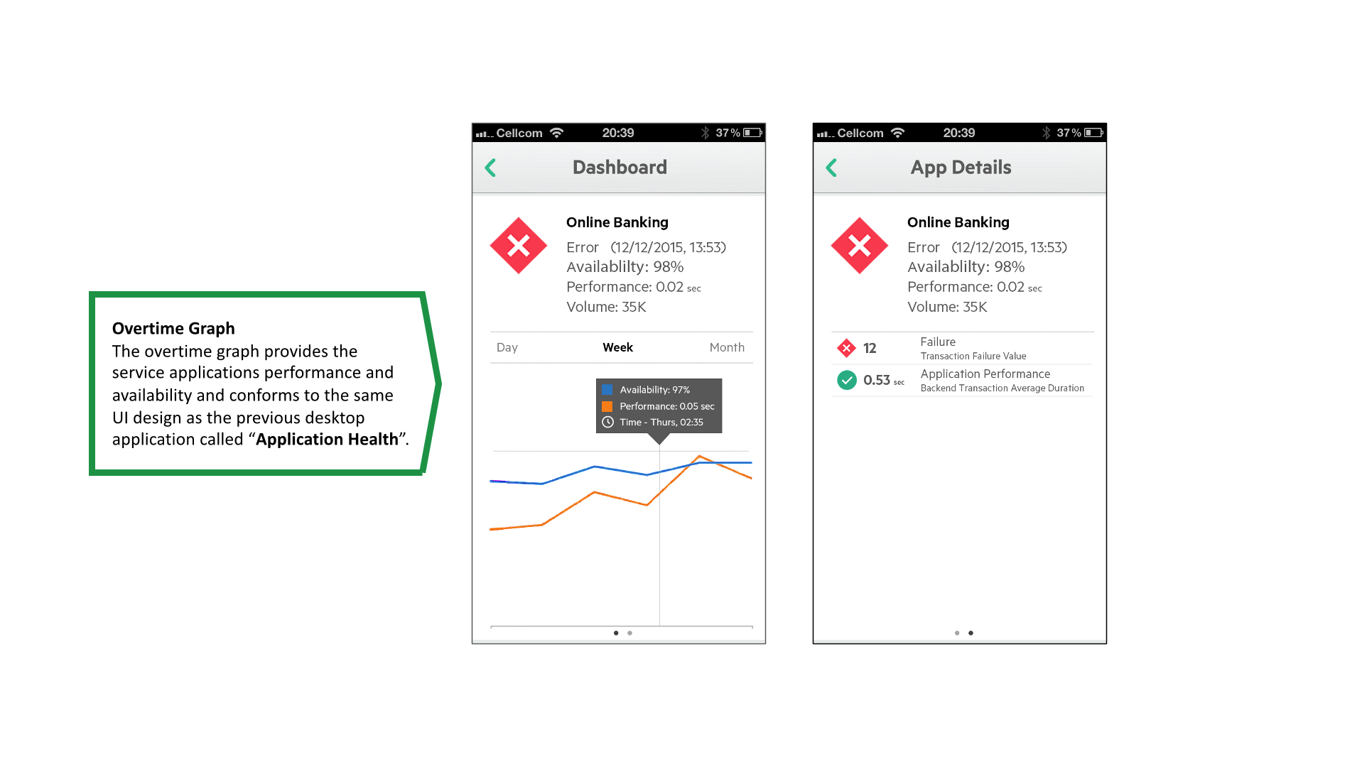
App Health 32px
Software 24px
Solutions 16px
Body text 14 px
HP PRODUCT SUITE
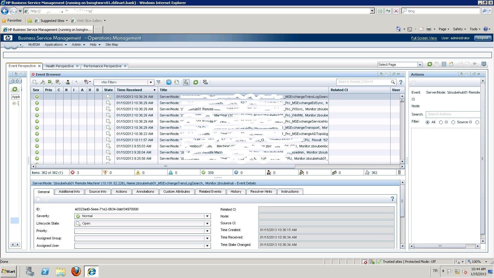
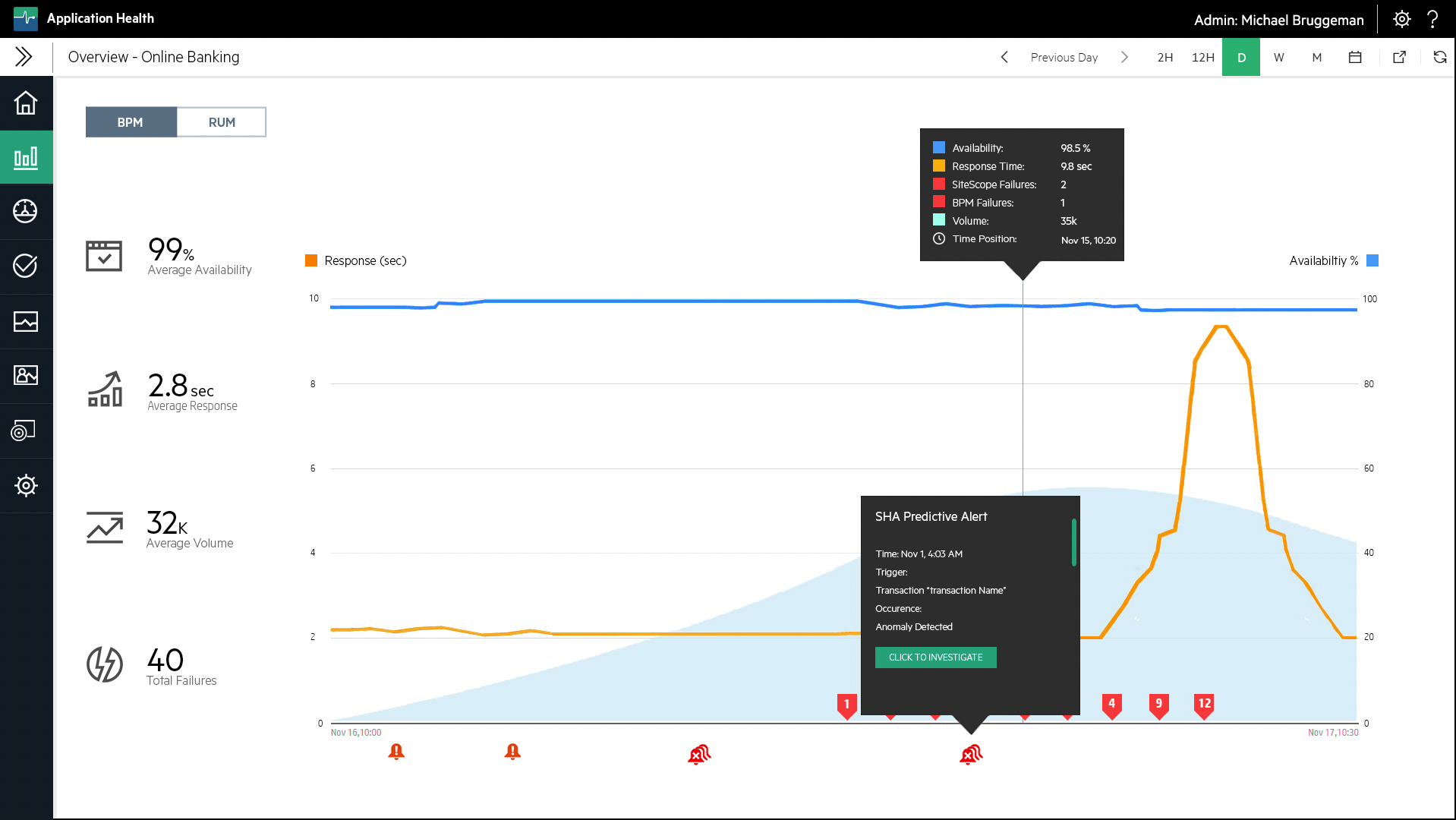
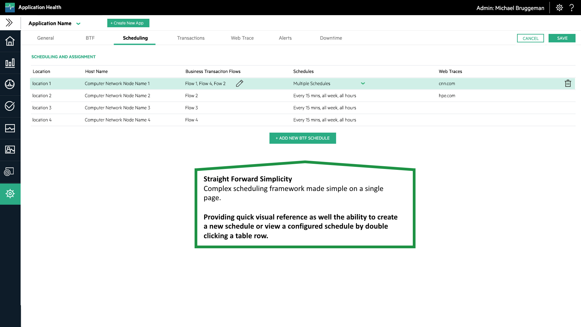
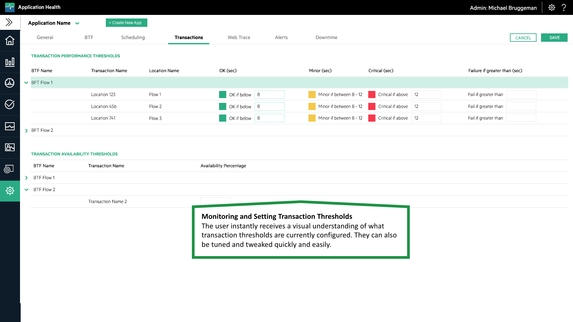
Design the HPE AppPulse Application Suite (Application Health) that provides performance monitoring , diagnostics with a flawless user experience from scratch.

RESPONSiVE DESiGN
Design Goal – Create a modern SaaS product suite that could support increased product complexity overtime and product scalability. The product had to have multi language support (i18n) and be fully government compliant.
Use Case – Enable users to easily monitor websites, Cloud and SaaS services from the end-user’s perspective.
Performance Objective – Provide the ability to get the monitoring up and running within a few minutes. Provide easy to understand availability and performance monitoring for all levels of users.
THE DESiGN PROCESS
The design method I employed to create this solution was multifaceted. I performed a series of discussions with multiple stakeholders.
These stakeholders included preferred HPE customers, the HPE Innovation Council and multiple test labs, product sales managers and leveraged multiple end user questionnaires.


CORE DESiGN TASK
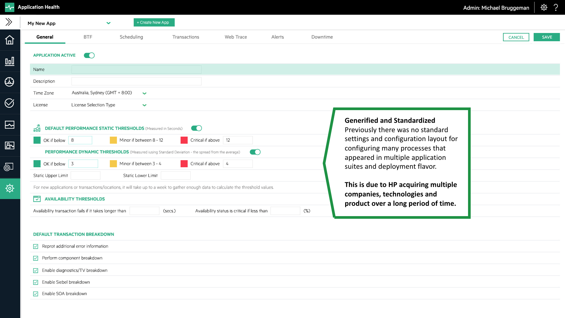
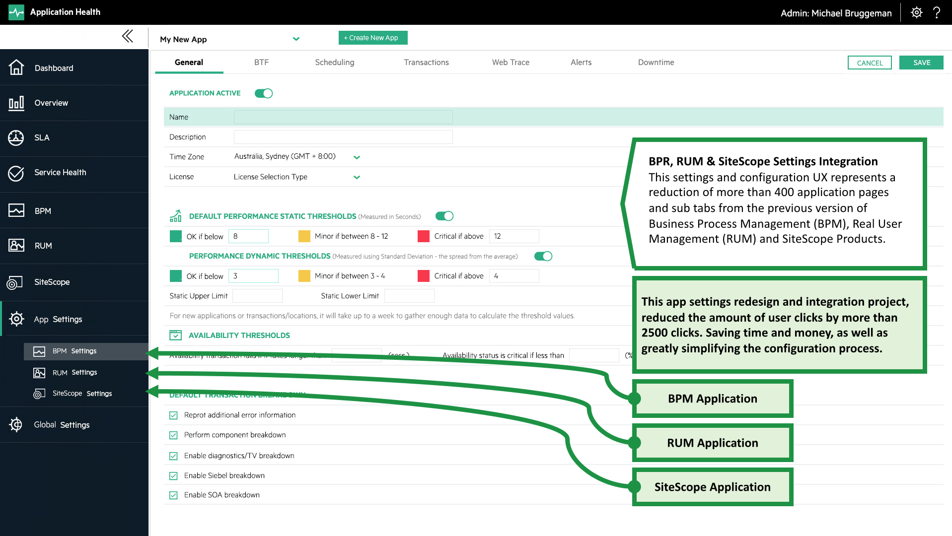
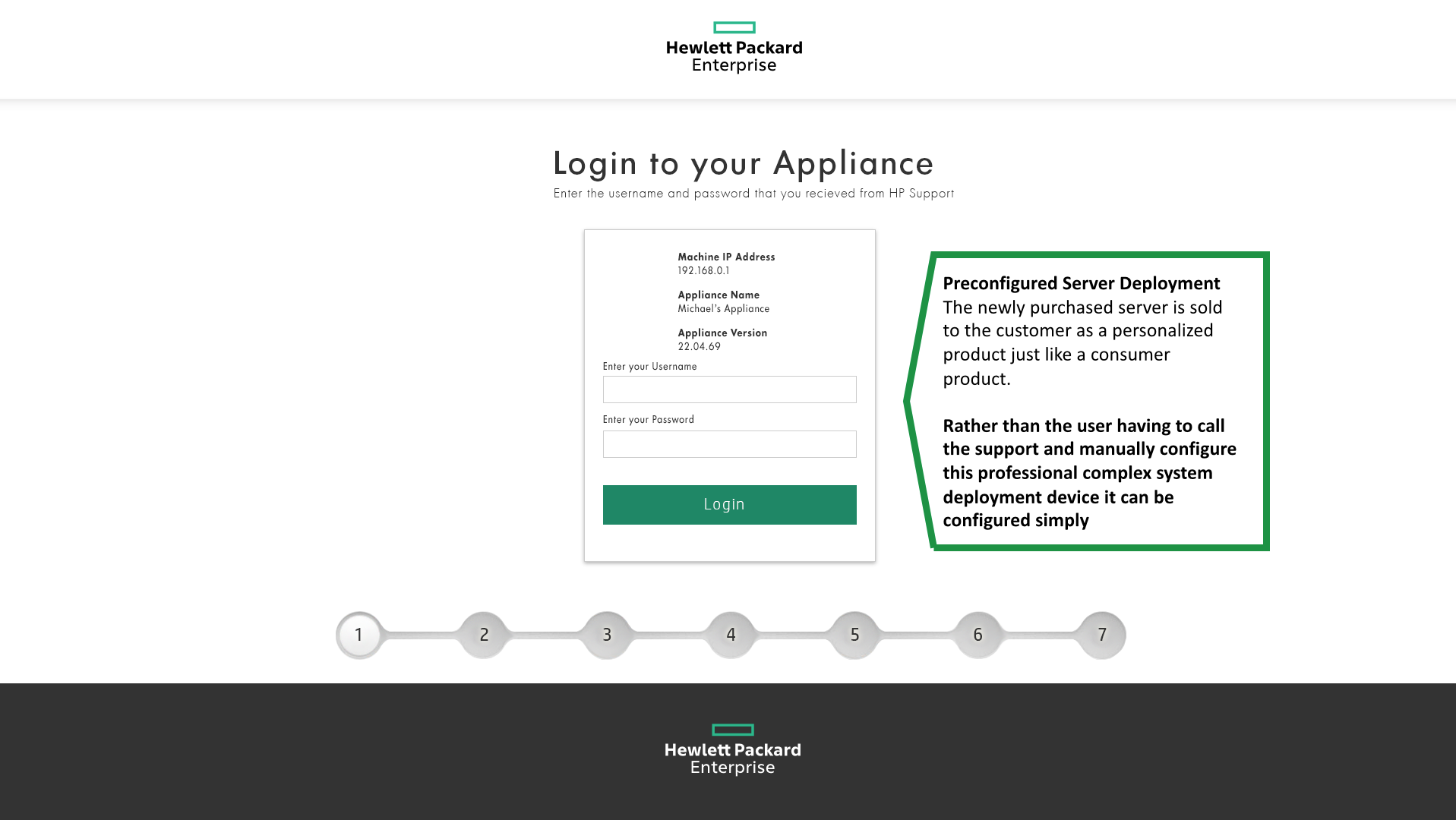
The product suite was based on existing underlying technologies, customer deployments and a massive install base (more than 150,000 users).
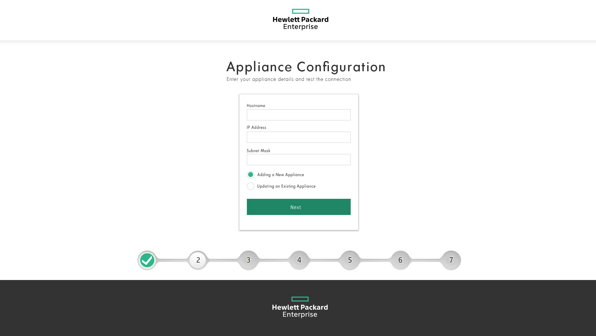
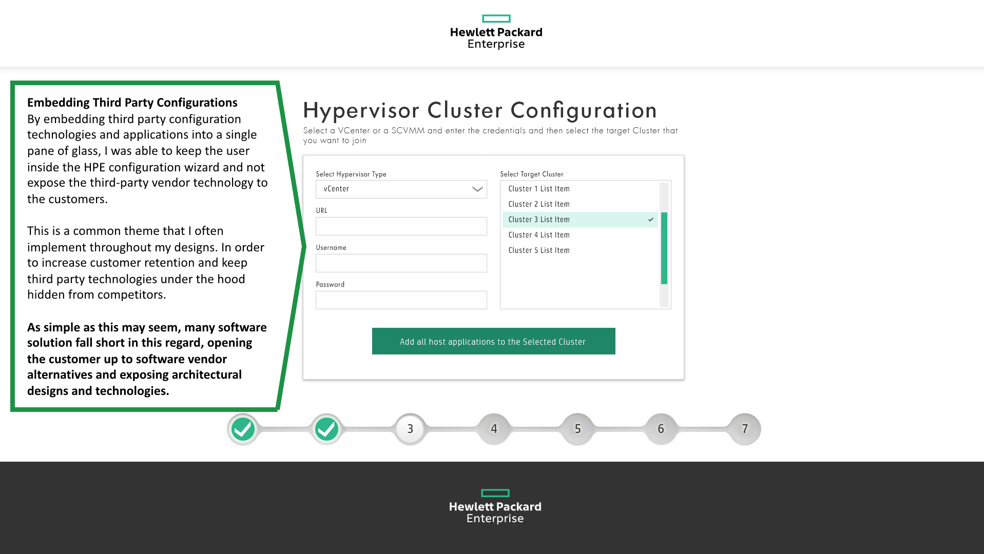
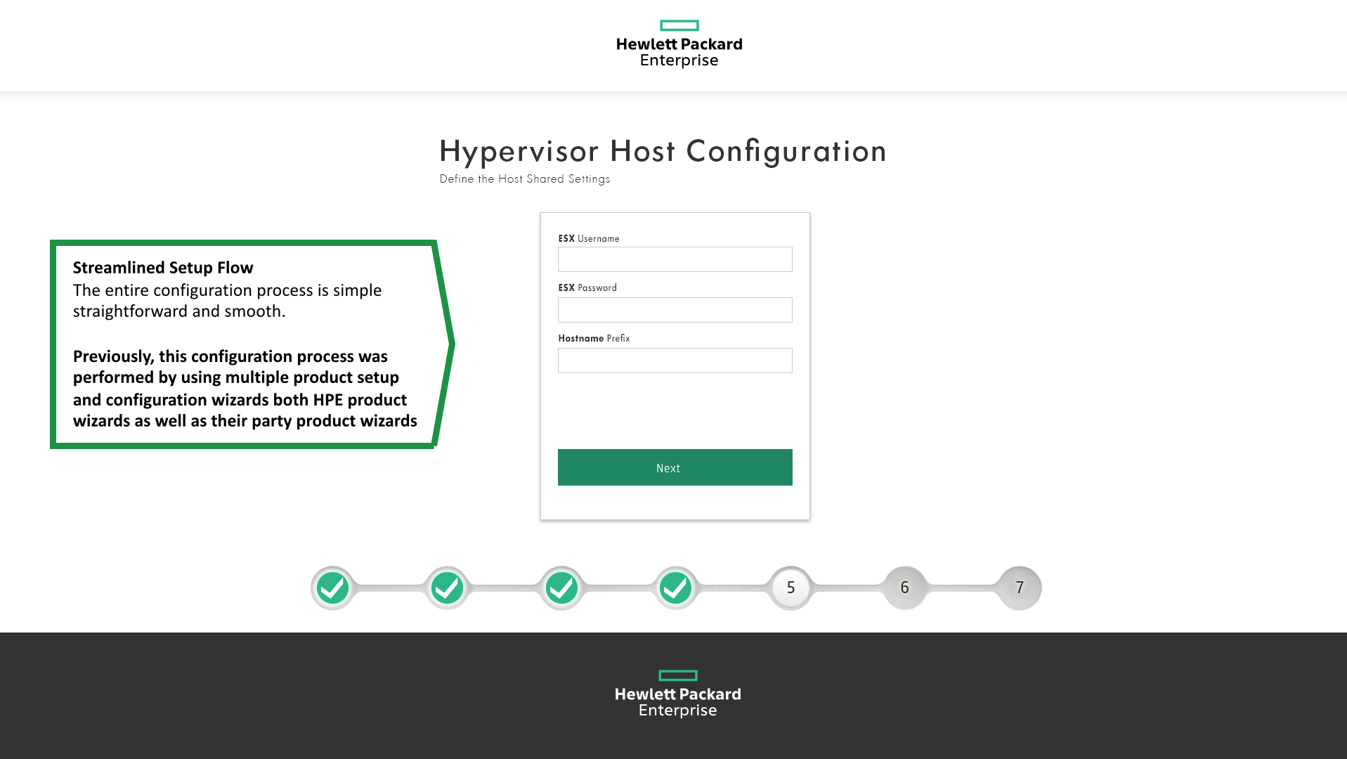
Main Focus – The central task was to greatly reduce the amount of clicks for performing a specific task, keep the user inside the application (embed third party add-ons) and create clear task-based flows.

People understand software via the user interface and not via technical explanations, so I try to keep it as simple and straightforward as possible. I ensure that the UX designs match the real application interfaces so that the customer or user can focus on the application functionality rather then try to understand or decipher what they are looking at.
THE SOLUTION
By multiple views into a single pane of glass I was able to improved the users understanding and exposed the inter dependability of many of the systems attributes.
- Performance
- Availability
- Failures
- Alerts
- Traffic Volume
EASY & SiMPLE
The product solution removed more than 850 different screens (thousands of clicks) and more than 12 separate external products and plugins.


Take a deep dive into the product user experince and check out some of the sceenshots up close and in detail.
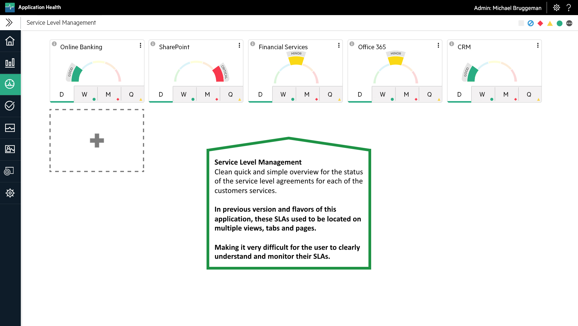
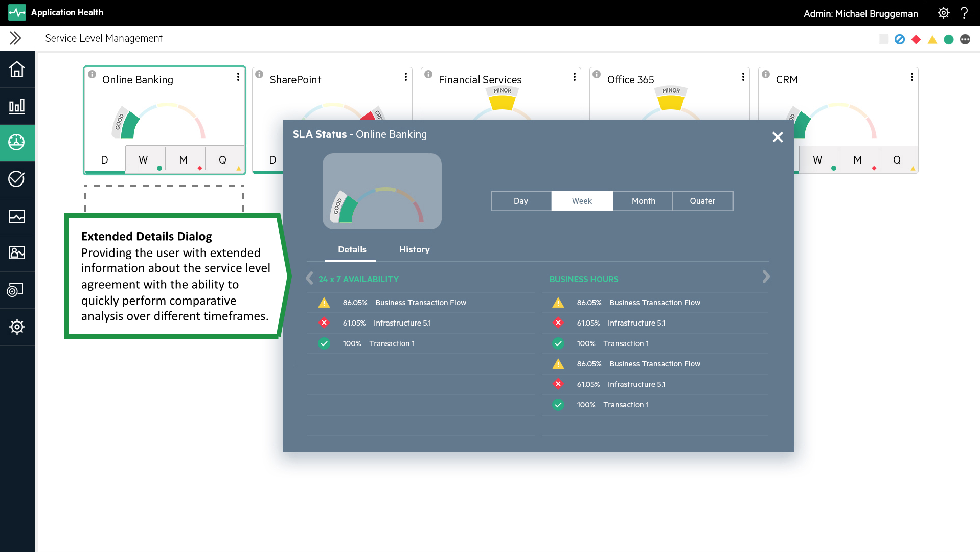
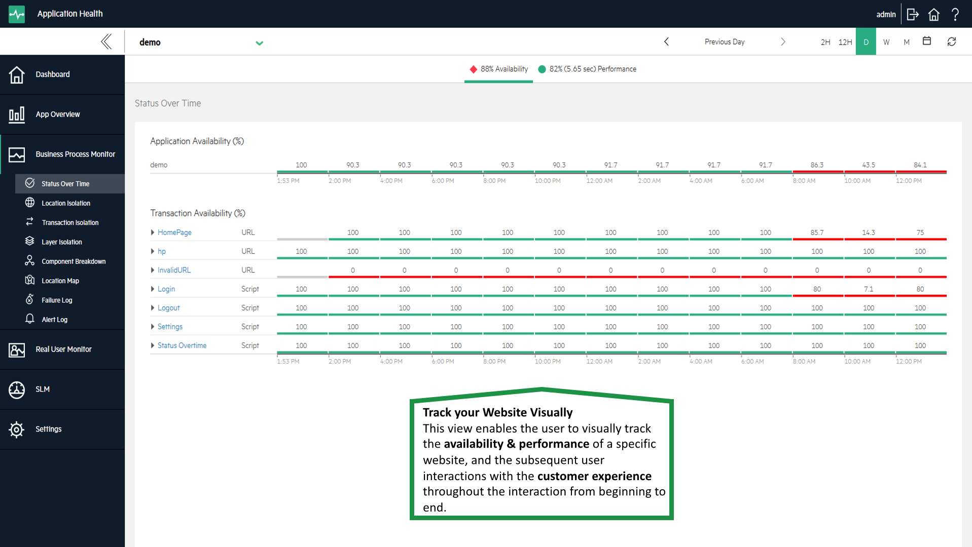
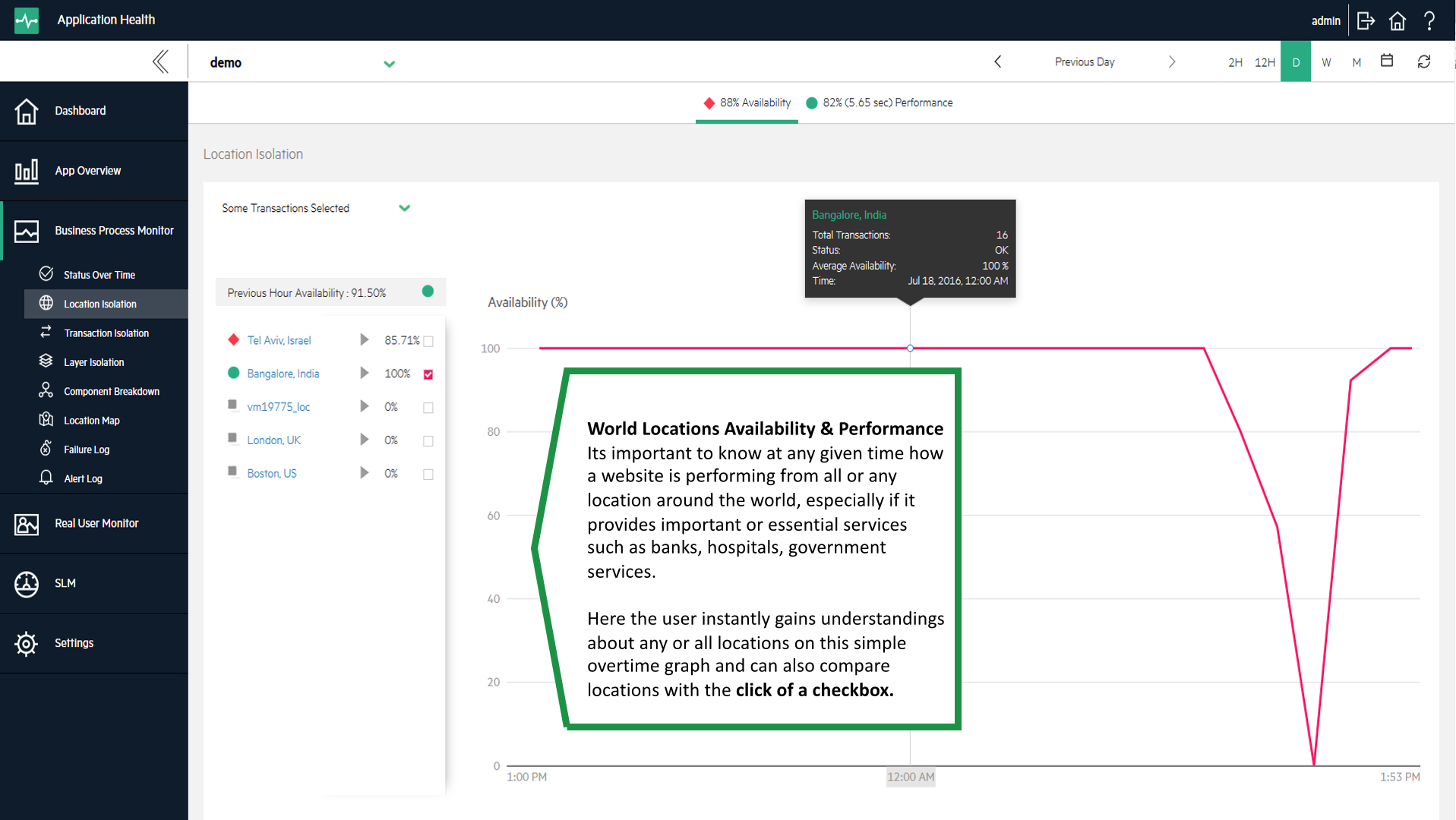
SCREENSHOTS

1

2

3
4
5

6

7
8
9
10

11

12
13
14
15
16

17
18

19

20
a
b
c
d
e

f
g

h
i
j
Z1
Z2