The objective of each UI component is to facilitate a specific task, enhance the design efficiency and provide user satisfaction. The user interface elements also include the page and screen dimensions as the starting point which define the user interface real estate.
Whether you are designing a standard desktop page layout or a mobile device screen the design principles remain the same, as well as the UI component library that you use to construct your masterpiece.
User interface elements include: headers, main body, footers, dialogs, buttons, text fields, checkboxes, sliders, icons, tags, message boxes, tables and pagination mechanisms just to name a few.
UI Component Usage
You can use the UI components anyway you like, but there are some expected design standards that users have come to expect. As computer software has become far more prevalent in our society for performing many different types of day to day tasks, so too does the user interface understanding and workflow sophistication increase. User expectations are constantly on the rise.
UI Component Positioning
In addition to the specific component functionalities, each dialog and its subsequent UI components also contains certain inherent border spacing, component spacing and positioning layout standards
UI Component Types
The following section will briefly describe the various types of UI component available in your design palette. I have tried to keep the controls that I have listed to the basic root UI component types. Obviously, there are multiple variations of these controls, but the basic categories and control types remain the same.
UI Component States
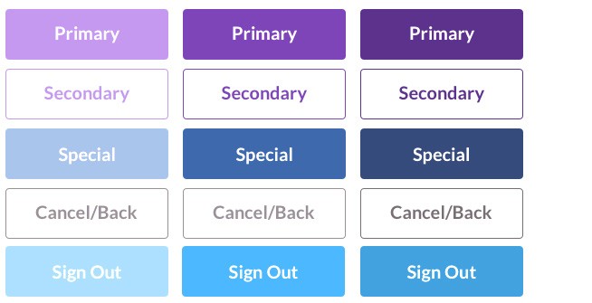
A UI Component state, communicates to the user the status of UI elements. You should try to maintain the similarity for each of your UI elements. Each element (buttons) should have clear affordances that distinguish it from other states and the surrounding layout.

True innovation comes from having to create something new, fresh and innovative from the limited set of components available.
Input Controls
Input controls are interactive elements in your application interface that enable the user to input data into the application.
Checkbox
Allow the user to select one or more options from a set. It is usually best to present checkboxes in a vertical list. More than one column is acceptable as well if the list is long enough that it might require scrolling or if the comparison of terms might be necessary.
True innovation comes from having to create something new, fresh and innovative from the limited set of components available.
Input Controls
Input controls are interactive elements in your application interface that enable the user to input data into the application.
Radio Button
Are used to allow users to select one item at a time.
Drop Menu
Drop menu lists allow users to select one item at a time from the list, similarly to radio buttons but are more compact allowing you to save space. Consider adding text before the drop menu control, such as “Select One Item” to help the user recognise the necessary action. Some people consider them rather irritating than useful. But this really depends on a purpose and context.

List Box
Like checkboxes, allow users to select multiple items at a time, but are more compact and can support a long list of options if needed.

Buttons
A button indicates an action upon touch and is typically labeled using text, an icon, or both.
Drop Down Button
The Duel Purpose dropdown button consists of a button that when clicked displays a drop-down list of mutually exclusive items.

Toggle Switch
A toggle button allows the user to change a setting between two states. They are most effective when the on/off states are visually distinct.
Input Field
Text input fields allow users to enter text. It can allow either a single line or multiple lines of text.

Date Picker
A date picker allows users to select a date and/or time. By using the picker, the information is consistently formatted and input into the system. The same picker is used for time

Navigational Components
Navigation enable the user to move between screens of an application interface to complete tasks.
Breadcrumb
Breadcrumbs allow users to identify their current location within the system by providing a clickable trail of proceeding pages to navigate by.

Search Box
Basically, the search box allows users to enter a keyword or phrase (query) and submit it to search the index with the intention of getting back the most relevant results. Typically search fields are single-line text boxes and are often accompanied by a search button.

Pagination Carousel
Pagination divides content up between pages and allows users to skip between pages or go in order through the content.

Slider Control
A slider, also known as a track bar, allows users to set or adjust a value. When the user changes the value, it does not change the format of the interface or other info on the screen.

Tags and Chips
Tags allow users to find content in the same category. Some tagging systems also allow users to apply their own tags to content by entering them into the system.

Symbol Font Usage – Button Icons
Icons – An icon is a simplified image serving as an intuitive generic symbol that is used to help users to navigate the system regardless of language.
Symbol fonts are now being used to replace blocky raster images for smooth vector images in your HTML. By utilising a symbol font for your buttons means that you can use an icon font for all your application interface needs. This makes your HTML page packet size much smaller, meaning that the page will load faster into the browser improving user experience. Vector image (fonts) can scale endlessly up or down for any resolution, so they are automatically compatible for all screen resolutions.
Image Carousel
Carousel – Image carousels allow users to browse through a set of items and make a selection of one if they so choose.

Information Components
Information components provide the application with a means of communicating with the user. These information popup tooltips and status icons are universally used throughout almost all application on the market today. Their generic nature makes them easy to understand for most people regardless of their personal amount of “flight time” or experience.
Tooltips
A tooltip allows a user to see hints when they hover over an item indicating the name or purpose of the item.

Status Icons
These icons provide the user with the information about the current status of an object, service or state of an interface item or object. They also provide indicative information about what might happen if the user activates a certain feature of function. There are generic icons used for all software applications
Progress Bar
A progress bar is a time relative control that indicates to the user the amount of time a specific task should or will take. These controls are usually not time accurate. They can also be used to show where a user is “relative to a whole process” as they advance through a series of steps. Typically, progress bars are not clickable.

Notifications
A notification is an update message that announces something new for the user to see. Notifications are typically used to indicate items such as the successful completion of a task, or an error or warning message.

Message Box
A message box is a small window that provides information to users and requires them to take an action before they can move forward.

Modale – Popup Dialog
A modal popup window is a graphical control element, it is subordinate to an application’s main window. When opened or activated, it creates a mode that disables the main window but it remains visible, with the modal window as a child window object in the active forefront of the application. A modal popup window requires users to interact with it in some way before they can return to the applications main interface.

Containers
A container is the most basic layout element. A container is a UI element designed to display a page component to the maximum width of a user’s screen. Containers contains other UI components such as tables.
Tables
It is essential to fully understand the importance of the table, as it is the main building block for all user interface design, both visibly to the end user and as the main construction element for the user interface developer.

Related Articles
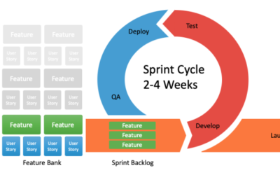
How to Prioritize your Product Backlog
A product backlog is the definitive list of all the new epics, features (changes to existing features), user stories, bug fixes, infrastructure changes and maintenance items of your software product. It is also the place to add any other additional tasks that a...

Job Searching – Is Being a Pro Enough?
There comes a time in everyones career that they have to look for a new job, the exact reason is unimportant but the following chain of events is the same. All of sudden, you need to update your online professional profile, renew and update your resume and remember...
Understanding Chinese Cultural Norms
To be able to work and interact with people of different ethnic backgrounds it is often important to spend some time getting to know who the people you are interacting with. Where they come from, what are their cultural expectations and how best to communicate with...
Recent Comments