A good user interface is simple, clean and focuses on what functions the user needs to perform. A good design ensures that the interface components are easy to use and understand. The user interface (UI) integrates the concepts from the functional design, graphic design, user experience and the information architecture in a unified single pane of glass for the user.
Important Note: An evolutionary transformation has occurred to product user interfaces in the last ten years. The simplicity, ease of use and lack of previous knowledge required to perform a specific task and been greatly diminished.
The User Interface Revolution
The general populous’s understanding and expectations of how software applications should look and work has become standardised. The ease with which a task must be performed has become user expectation. Software products that do not support simple task paths and easily repeatable functionalities are simply discarded and replaced with another similar application that the user finds easier to use and provides them with instant gratification.
With the board introduction of the smart phone as the main form of computing for the masses, many computing tasks have become simple and sexy functionality flows or “click sequences”.
The user can perform a broad range of tasks within the confines of a simple product user interface and the required knowledge and learning curve required to achieve a high level of accuracy, success and understanding have become almost childlike.
Basic Concepts and UI Components
The following article will introduce you to the basic design concepts and component building blocks for creating a software product user interface, commonly referred to as the products UI.
User Interface Building Blocks
Before you start to design a user interface you should first become familiar with the basic building blocks that are common to all software application interfaces. These UI design components all have specific purposes and are used for performing very specific tasks.
Their position on the screen and their interactivity are all carefully measured and placed.

Selecting the Correct UI Component
The objective of each UI component is to facilitate a specific task, enhance the design efficiency and provide user satisfaction. The user interface elements also include the page and screen dimensions as the starting point which define the user interface real estate.
Whether you are designing a standard desktop page layout or a mobile device screen the design principles remain the same, as well as the UI component library that you use to construct your masterpiece.
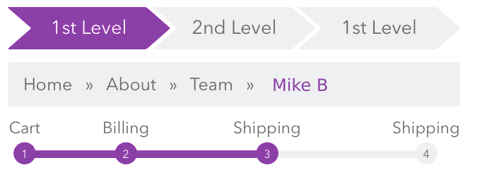
User interface elements include: headers, main body, footers, dialogs, buttons, text fields, checkboxes, sliders, icons, tags, message boxes, tables and pagination mechanisms just to name a few.
All UI’s are built using the same finite palette of components.

User Interface Data Handling
In addition to the UI components that comprise your application, your interface design may also have to consider data handling capabilities and features such as lazy loading, bulk loading, scrolling sections, search and data retrieval mechanisms and data ingestion technologies. This means that you must have an understanding of the “back-end” under the hood side of the application and not just the sexy front end interface.
Standard Practices and Designs
As you start to design your “user interface” there are a few technical and design limitations that must be fully understood before you can get started. These are framework elements that act as a container for all UI/UX designs. You must start with these UI components as they represent the way that your user interface connects and communicates with the browser, operating system, the server, the database and the underlying commuter and communication technologies.
Once you understand the standard page layout components you can then start to populate your design with individual UI components and work flows.
Standard Page Layout
The first standard UI elements that underlie all interfaces are the rudimentary framework elements. They are the following components and layout positions. You can pretty much count on your design to have to support the following layout designs and panel functionalities.
Interface Elements Used – Application header, footer, navigation sidebar, main body and side panel elements.

Compact Sidebar
In order to allow for multiple resolutions and different screen sizes certain elements should be collapsible to maximise the interface real estate.

Interface Elements Used – Application header, footer, navigation sidebar and main body elements.
Hidden or Collapsible Sidebars and Panels
To further simplify the UI and reduce the amount of screen elements further elements can be hidden from the main body view pane.

Interface Elements Used – Application header, footer and main body elements.
Example Screen
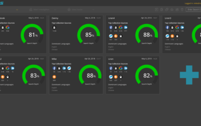
The following screen example illustrates the use of several UI components such as header, footer, main body pane, extendable side navigation bar, drop menus, tab dialogs, table lists, world map, overtime bar graphs and icon buttons.

UI Component Usage
You can use the UI components anyway you like, but there are some expected design standards that users have come to expect. As computer software has become far more prevalent in our society for performing many different types of day to day tasks, so too does the user interface understanding and workflow sophistication increase. User expectations are constantly on the rise.
UI Component Positioning
In addition to the specific component functionalities, each dialog and its subsequent UI components also contains certain inherent border spacing, component spacing and positioning layout standards

Required User Interface Compliance Standards
These industry design and layout standards are also required when designing a UI that must support cross platform compatibility, different browser types and standard screen resolutions. Not to mention multiple language support and ADA interface provisioning required for government websites and software interface designs for enterprise solutions.
Utilising Third Party Components in Your UI
A great way to quickly increase and improve UI functionality is by carefully utilising third party technology vendors.
There are many UI component libraries available on the market, and the online availability of these libraries is constantly gowning and improving in quality,
These libraries also have another very important benefit. They have been thoroughly tested for almost all available browsers, screen types and resolutions. So, they are a great, good quality starting point for any new project.
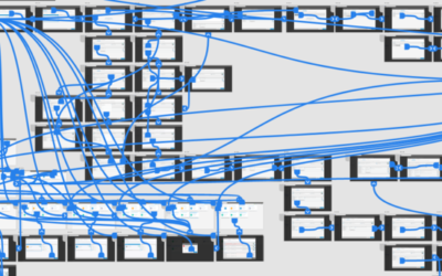
The interface example shows an implementation of the Keylines graph component.
See – Keylines – Graph Visualisation Technology
Cambridge Intelligence – Keylines Graph Component
I have used the Keylines topological graph component in many projects and on a number of my interface implementations and they have never failed to deliver incredible usability, functionality and add amazing animations to the UI. They do require a certain level of developer skill and understanding to fully utilise Keylines toolbox and functionality.
As with all third party plug-ins they require some tweaking and customisation to fully benefit from their extensive set of libraries, but it’s worth the extra effort.
Keylines have a great support team and help your developers create customised functionality when needed.
Example Screen
The screen example utilises an application header, drop menus, a button toolbar and counter widget, multiple extendable side navigation bars, a topology graph component (Keylines – third party component), LED status controls, duel use buttons and a navigation and center screen control.

Conclusion
Remember, when creating your application UI make sure to keep it simple and focus on the user requirements and don’t go overboard with your designs. Remember the importance of correct spacing pixel accurate alignment between controls and leave breathing space between elements.
And, don’t forget to to have fun and get excited….
Go to the Original Article
Related Articles
I have written some additional articles that are married to the topic of “prioritising your product backlog” as there are many overlapping disciplines involved in creating amazing software solutions.
Read the following articles to gain further understandings and insights for creating better software products:
Pixel Accurate UX Designs
When designing a new product UI, I alway try to employ the K.I.S.S method, of "keep it simple stupid", it hasn't failed me yet. If on the other hand you have no choice but to create a new custom control then provide the developer with a "pixel accurate" screenshot...
How to Prioritize your Product Backlog
A product backlog is the definitive list of all the new epics, features (changes to existing features), user stories, bug fixes, infrastructure changes and maintenance items of your software product. It is also the place to add any other additional tasks that a...
UX Prototyping – The Only Way to Fly
Creating a software solution is a labor intensive human endeavour. It requires input from many different disciplines and stakeholders for it to reach fruition. So, before you start to crunch code maybe you should give some thought to first building a full interactive...
Recent Comments